Introduction
Most organizations aren't short on data. They're short on clarity. Executives open spreadsheets, analysts dig through disconnected reports, and operations teams react to problems they could have seen coming when the right numbers weren't visible at the right moment.
Power BI dashboards solve this by consolidating scattered data sources into a single, always-on view of the metrics that matter most. Microsoft has held the top position in the 2025 Gartner Magic Quadrant for Analytics and Business Intelligence Platforms for 18 consecutive years - a signal of both platform maturity and continued enterprise adoption.
This guide covers everything needed to build effective dashboards: what they are architecturally, the four main types, a step-by-step build process, design principles that drive adoption, and governance considerations for enterprise deployments.
TL;DR
- Dashboards live exclusively in Power BI Service - they cannot be created in Power BI Desktop
- They are single-page canvases assembled by pinning visuals from published reports
- Design clarity determines whether a dashboard gets used or ignored
- Enterprise deployments require governance planning beyond native Power BI tooling
What Is a Power BI Dashboard?
Microsoft defines a Power BI dashboard as a single page - often called a canvas - that tells a story through visualizations. Each element on that canvas is a "tile": a snapshot of data pinned from a report, a Q&A result, an Excel workbook, or a streaming data source.
Dashboards vs. Reports: A Critical Distinction
These two terms get conflated constantly, and the confusion causes real problems during builds.
| Dimension | Dashboard | Report |
|---|---|---|
| Pages | Single page only | One or more pages |
| Where it lives | Power BI Service only | Desktop + Service |
| Primary purpose | Monitoring & visibility | Analysis & exploration |
| Interactivity | Limited (live tiles support filter interaction) | Full cross-filtering, slicers, drill-through |
| Built by | Pinning visuals from reports | Drag-and-drop in Report View |
Dashboards are also unavailable in Power BI Report Server - this is a Service-exclusive feature.
Why Dashboards Matter for Decision-Makers
The value isn't in depth - it's in speed. An operations manager doesn't need to run a query; they need to see whether the production line is on track before their 8 a.m. standup.
Dashboards make this possible by:
- Aggregating tiles from multiple reports and datasets onto a single canvas
- Refreshing automatically as underlying data updates
- Presenting a consistent view to every stakeholder, regardless of who's looking
Types of Power BI Dashboards
The right dashboard type depends on who's reading it and how often they need to act. TDWI's research on performance dashboards identifies three foundational categories - strategic, tactical, and operational - with a fourth analytical type widely used in practice.
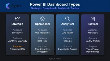
Strategic Dashboards
Built for executive leadership - CEOs, COOs, board members - strategic dashboards track high-level KPIs over medium-to-long time horizons. Revenue growth, market share, customer satisfaction scores, and year-over-year comparisons are typical content, usually refreshed monthly or quarterly.
Operational Dashboards
These monitor active processes in real time or near-real time, serving front-line teams and operations managers. Examples include:
- Supply chain throughput and delivery status
- IT infrastructure health and incident counts
- Manufacturing floor cycle times and defect rates
- Energy infrastructure asset status and safety compliance indicators
For organizations in sectors like manufacturing, healthcare, and oil and gas, operational dashboards are often the highest-priority Power BI deliverable - the one that directly affects what happens on the ground today.
Analytical Dashboards
Designed for analysts and data teams, analytical dashboards support trend exploration, cohort comparisons, and deep investigation. Profit-and-loss trend boards, product development pipeline trackers, and customer behavior analyses fall into this category. Where operational dashboards flag what is happening, analytical dashboards explain the cause - and surface the patterns that inform the next decision.
Tactical Dashboards
Tactical dashboards sit between strategic and operational. They track medium-term project or team performance - typically using daily or weekly data - and serve managers and department leads. Project milestone boards and employee performance scorecards are common examples.
| Dashboard Type | Primary Audience | Data Cadence | Core Purpose |
|---|---|---|---|
| Strategic | Executives, board | Monthly / quarterly | Track enterprise KPIs and long-term trends |
| Operational | Front-line teams, ops managers | Real-time / near-real-time | Monitor active processes and flag issues |
| Analytical | Analysts, data teams | Variable | Investigate causes and explore patterns |
| Tactical | Managers, department leads | Daily / weekly | Track project and team performance |
How to Build a Power BI Dashboard: Step-by-Step
The workflow spans two tools. Data preparation and report building happen in Power BI Desktop. Dashboard assembly, sharing, and monitoring happen in Power BI Service. Understanding this separation prevents unnecessary confusion early on.
Step 1: Prepare and Connect Your Data
Open Power BI Desktop and use Home → Get Data to connect to your source - Excel, SQL Server, Azure Synapse, Snowflake, Databricks, or any of hundreds of supported connectors.
Once connected, open Power Query Editor to clean your data before loading it into the model:
- Remove duplicate rows
- Filter out irrelevant records
- Rename and reformat columns for clarity
- Handle null values explicitly
Only load clean, structured data into the model. Problems introduced here compound downstream.
Step 2: Build Your Report in Power BI Desktop
In Report View, drag fields onto the canvas and use the Visualizations pane to select chart types. Every visual you create here is a tile candidate for the dashboard later.
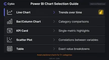
Chart type matters. Pick based on the analytical question, not aesthetics:
- Line charts - trends over time
- Bar/column charts - category comparisons
- KPI cards - single-metric highlights
- Scatter plots - correlations between two variables
- Tables - detailed breakdowns where exact values matter
Avoid pie and donut charts when comparing more than four or five categories. Nielsen Norman Group research confirms that length and 2D position are easier for users to process quickly than area or angle - bars outperform circles for fast comprehension.
Step 3: Publish to Power BI Service
When the report is ready, click Publish in Power BI Desktop and select a workspace. This uploads your .pbix file and makes the report available in the Service.
The published report becomes the source of truth for your dashboard. Edits made in Desktop and re-published flow automatically to any live-pinned tiles.
Step 4: Pin Visuals and Assemble the Dashboard
In Power BI Service, hover over any report visual and click the pin icon. You can pin to a new or existing dashboard.
Two pinning approaches behave differently:
- Individual visual pin - creates a static snapshot of that chart type; if you change the chart type in the report later, the tile retains the original visualization type (though data continues refreshing)
- Live report page pin - pins an entire report page as an interactive tile; users can interact with filters and slicers directly from the dashboard canvas
Step 5: Customize, Set Alerts, and Schedule Refresh
After assembling tiles, configure the operational layer:
- Resize and rearrange tiles by dragging on the canvas to create visual hierarchy
- Set data alerts on KPI cards, gauges, and card tiles to notify users when values cross thresholds (e.g., alert when inventory falls below a set level)
- Apply a dashboard theme - light, dark, or a custom JSON theme with brand colors
- Configure scheduled refresh on the underlying dataset; Power BI Pro supports up to 8 refreshes per day, Premium and Fabric capacities support up to 48
Step 6: Share and Manage Access
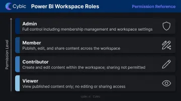
Use the Share button in Power BI Service to invite colleagues by email. Assign permissions carefully using workspace roles:
| Role | What They Can Do |
|---|---|
| Admin | Full control, including managing membership |
| Member | Publish, edit, and share content |
| Contributor | Create and edit content, no sharing |
| Viewer | View only |
For external sharing, Microsoft Entra B2B supports guest user access. The Publish to web option creates a public embed link with no authentication. Use it only for genuinely public data - never for sensitive or internal content.
Email subscriptions let you push scheduled dashboard screenshots to stakeholders who prefer inbox delivery over logging in.
Once Step 6 is complete, the dashboard is live and operational. The next consideration is design - how to arrange and format tiles so the most critical information registers at a glance.
Power BI Dashboard Design Best Practices
A dashboard that requires explanation has already failed. The goal is immediate comprehension - any viewer should identify the most important insight within seconds of opening it.
Layout and Visual Hierarchy
- Place the single most critical KPI or trend top-left or top-center in the largest tile
- Group related metrics into visual clusters so the eye moves logically across the canvas
- Limit the total number of tiles. Cognitive load increases with every additional element - Nielsen Norman Group notes that minimizing mental processing demands directly improves usability
- Use consistent spacing and alignment; misaligned tiles signal disorder and undermine trust in the data
Color and Contrast
Define a two-to-three color palette and use color with intention:
- Red for below-target, green for on-track (but confirm this convention with your audience - color carries cultural meaning)
- Neutral backgrounds to avoid competing with data
- WCAG 2.2 requires a contrast ratio of at least 4.5:1 for normal text and 3:1 for large-scale text - this applies to dashboard text elements too
Avoid decorative gradients or background images that pull attention away from metrics.
The Audience-First Principle
Before finalizing layout, answer two questions: Who is the primary audience, and how often will they use this dashboard - and under what conditions?
An executive reviewing weekly performance needs high-level abstraction and minimal density. An operations manager monitoring a live production line hourly needs granular, real-time tiles that surface exceptions immediately.
Design for the most important audience segment first - then test with actual users before release. Dashboards built in isolation rarely survive first contact with the people they're meant to serve.

Enterprise Governance and Scaling Your Power BI Dashboards
At scale, governance determines whether Power BI becomes a trusted enterprise asset or a sprawling collection of dashboards nobody relies on.
Workspace Governance
Structure workspaces by business unit or project rather than by user. Apply RBAC so sensitive financial data or patient records are only accessible to authorized roles. Document data lineage clearly - stakeholders need to know which datasets feed which dashboards, especially when a metric looks wrong and someone needs to trace it back to the source.
MIT Sloan research found that 51% of chief data officers cite establishing clear data governance as their top responsibility, with data quality improvement close behind at 48%. These priorities directly affect dashboard trust.
Performance and Scalability
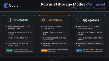
As dashboards proliferate across departments, dataset query performance becomes a bottleneck. Key decisions:
- Import mode stores data in Power BI's in-memory engine - fast queries, but requires scheduled refresh and has dataset size limits
- DirectQuery queries the source system at interaction time - always current, but performance depends on source system speed and network conditions
- Aggregations on large DirectQuery datasets can dramatically reduce query times for high-level dashboard tiles
Power BI Premium capacity provides dedicated resources for organization-wide deployments, removing per-user licensing friction for viewers.
Regulated Industry Considerations
Healthcare, oil and gas, and public sector deployments carry additional requirements. Dashboards consuming protected health information must align with HIPAA's technical safeguard requirements. Cybic structures regulated-industry BI engagements with RBAC, data lineage tracking, and compliance alignment baked into the architecture from the start - covering HIPAA, SOC 2, and GDPR requirements before the first dashboard goes live.
Power BI's native tooling supports sensitivity labels, certified dataset endorsements, and activity auditing. For most enterprise deployments in healthcare or financial services, those native controls need to sit inside a broader governance layer. That means documented refresh schedules, certified dataset endorsements, and audit trails showing who accessed what and when.
Extending Power BI with AI and Automation
Dashboards answer what happened. Operations teams in manufacturing, energy, and healthcare typically need the next step handled automatically - not just displayed.
Cybic's Drava platform connects enterprise data pipelines, machine learning models, and intelligent agents into a governed automation layer. Where a standard Power BI deployment surfaces an anomaly, a Drava-connected deployment can trigger a downstream workflow - routing an alert, initiating a process, or flagging a case for review - without waiting for a human to act on the visual.
For organizations that need predictive alerts or automated decision triggers on top of their Power BI infrastructure, this integration layer handles the handoff between what the data shows and what the operation does next.
Frequently Asked Questions
Is Power BI dashboard development still in demand in 2026 and beyond?
Demand remains strong. Microsoft was named a Leader in the Forrester Wave for Business Intelligence Platforms, Q2 2025, with the highest score for generative AI functionality. The ongoing enterprise shift toward self-service analytics and the integration of AI Copilot features are expanding Power BI's role well beyond traditional dashboards.
What is the difference between a Power BI dashboard and a report?
Reports are multi-page, interactive documents built in Power BI Desktop and used for analysis and exploration. Dashboards are single-page canvases in Power BI Service that aggregate pinned tiles from one or more reports, providing a high-level, monitoring-focused view of key metrics.
How do I share a Power BI dashboard with external users?
Internal sharing uses the Share button with email-based invitations. For external users, Microsoft Entra B2B guest access is the governed approach. Publish to web creates a public embed with no authentication, so use it only for genuinely public data and verify sensitivity labels and organizational data policies first.
What are the best chart types to use in a Power BI dashboard?
KPI cards for single-metric highlights, line charts for trends over time, bar and column charts for category comparisons, and scatter plots for correlations. Limit visual types to 3-4 per dashboard. Fewer types reduce cognitive friction and make dashboards faster to read.
Can Power BI dashboards display real-time data?
Yes. Power BI supports streaming datasets and DirectQuery connections for near-real-time data, and live-pinned report pages update as the underlying data changes. Note that new streaming dataset creation will no longer be supported after October 31, 2027; existing streaming models remain unaffected, so check current Microsoft documentation for the latest guidance.