Introduction
Hospitals and health systems generate enormous volumes of data - from EHR encounters and claims records to staffing schedules and patient satisfaction surveys. The problem isn't a shortage of data. It's that most of it sits in silos, locked inside proprietary systems that don't talk to each other.
A commissioned Forrester study of 500 health and life sciences leaders found that 64% cited inadequate data as a significant barrier to AI and analytics adoption - and 60% felt their organizations weren't moving fast enough. Tableau addresses that gap directly, turning fragmented health data into dashboards that actually drive decisions.
Tableau is a visual analytics platform used by hospitals, health systems, payers, and life sciences organizations to build interactive dashboards that support clinical, operational, and financial decisions.
It's a visualization layer, not a data infrastructure tool. Its value depends entirely on what sits beneath it: governed data sources, clean pipelines, and a compliance-ready architecture.
This guide covers the prerequisites, build process, and the pitfalls that derail most healthcare Tableau implementations before they deliver value.
Key Takeaways
- Tableau connects to EHRs, claims databases, and staffing systems - but almost always through a data warehouse or ETL layer, not directly.
- Top use cases: staffing optimization, patient outcome tracking, population health, and billing anomaly detection.
- HIPAA compliance requires a BAA, role-based access controls, PHI masking, and audit logging - none configured by default.
- Dashboard quality hinges on data freshness, governance configuration, chart type selection, and user adoption.
- Skipping data preparation and treating compliance as a post-build checklist are where most implementations fail.
How to Create Healthcare Data Visualizations Using Tableau
Step 1: Connect Your Healthcare Data Sources
Tableau does not connect directly to EHR systems like Epic or Oracle Health (Cerner). Instead, it pulls from reporting databases, data warehouses, or curated API layers.
Supported intermediary sources with native Tableau connectors include:
- Snowflake (strong fit for cloud warehouse-backed dashboards)
- Azure Synapse Analytics
- Databricks (useful for lakehouse-backed population health analytics)
- ODBC connections for SQL-based healthcare marts
Epic exposes data through its FHIR developer portal, and Oracle Cerner's Bulk Data APIs allow large-volume clinical data access. These are upstream exchange standards, though - they still require ETL pipelines, terminology mapping, identity matching, and PHI controls before Tableau can consume the data cleanly.
Before connecting anything, verify:
- Data in transit is encrypted (HHS requires transmission security for all ePHI over networks)
- Your extraction method (live connection, extract, or warehouse intermediary) aligns with your HIPAA obligations
- HL7/FHIR formatted data has been converted through middleware or an ETL layer
Organizations without a centralized data warehouse or a governed data layer will face significant pre-work before a single Tableau workbook is viable.
Step 2: Prepare and Clean Healthcare Data
Raw EHR exports are messy. Multi-system data dumps contain duplicate records, mismatched patient IDs, inconsistent date formats, and missing fields. Visualizing uncleaned data doesn't just produce inaccurate charts - it erodes clinical trust in the entire dashboard program.
Cleaning data upstream is the fix. Use Tableau Prep or an upstream pipeline to:
- Normalize patient ID formats across source systems
- Align timestamps (encounter dates, admission times, lab result timestamps often differ by source)
- Resolve duplicate records and flag missing required fields
- Remove or mask PHI fields not required for the specific use case
There's no universal completeness benchmark. Peer-reviewed clinical data quality frameworks (including the Kahn framework for clinical research) focus on conformance, completeness, and plausibility at the dataset level.
Define field-level thresholds by use case. For a readmission dashboard, that might mean requiring 100% population of encounter date, facility, and primary diagnosis before the dataset is considered visualization-ready.
Tableau Prep supports aggregate, join, and union operations, and can run R or Python scripts within flows for more complex transformation or model-based preparation.
Step 3: Select the Right Visualization Type
Chart selection in healthcare isn't aesthetic - it's functional. A JAMA Network Open study found that EHR visualization strategies were directly associated with differences in physician cognitive workload. The wrong chart in a clinical context slows decision-making rather than supporting it.
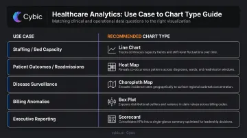
Match visualization type to decision context:
| Use Case | Recommended Chart Type |
|---|---|
| Staffing levels, bed capacity | Real-time line charts, KPI scorecards |
| Patient outcomes, readmission trends | Heat maps, scatter plots, cohort charts |
| Disease surveillance, population trends | Choropleth maps, time-series area charts |
| Billing anomalies | Box plots, outlier scatter charts |
| Executive reporting | Summary scorecards, trend indicators |
The three dashboard archetypes in healthcare:
- Strategic - trend analysis over weeks/months/years for executive and quality committees
- Operational - real-time or near-real-time monitoring for charge nurses, bed managers, staffing coordinators
- Analytical - deep-dive exploration for clinical analysts and population health teams
Tableau's "Show Me" feature is a useful starting point but shouldn't drive final chart selection. Match each metric to the decision being made and the viewer's analytical context. A scatter plot appropriate for a population health analyst is entirely wrong for a ward nurse checking capacity at shift change.
Step 4: Build, Configure, and Deploy
Configure role-based access control (RBAC) within Tableau Server or Tableau Cloud before publishing anything. Clinicians, department heads, and executives should only see the data layers relevant to their function. Tableau supports row-level security through entitlement tables and user filters - apply these for PHI segmentation, not just content permissions.
Set refresh schedules based on use case:
- Staffing and capacity boards: near-real-time or live connection
- Clinical quality and outcomes: daily or shift-based extract refresh
- Population health and finance: weekly scheduled extracts with visible refresh timestamps
Tableau Cloud refreshes cached data every 12 hours by default - this needs to be explicitly configured per use case.
Pilot Before Full Deployment
Before organization-wide rollout, publish the dashboard to a pilot group. Document feedback on data accuracy, missing fields, and usability. One round of structured user testing before full deployment will prevent a far more expensive remediation after it.
What You Need Before Building Healthcare Dashboards in Tableau
The quality of a healthcare Tableau deployment is determined before a single visualization is built. Three prerequisites determine whether the project succeeds or stalls.
Data and System Prerequisites
You need access to structured, queryable healthcare data. A centralized data warehouse or lakehouse is the practical baseline. Organizations relying solely on raw EHR exports or disconnected spreadsheets will spend most of their project time on data preparation rather than dashboard development.
For enterprise healthcare organizations managing complex data pipelines, Cybic's Drava data intelligence platform establishes governed, compliance-ready data feeds with built-in RBAC, encryption, and auditability. The result is a clean, access-controlled layer that connects directly into downstream tools like Tableau.
Compliance and Governance Readiness
Before any PHI flows through a Tableau environment:
- Execute a Business Associate Agreement (BAA) with Salesforce/Tableau - this is a contract and configuration checkpoint, not a default product setting
- Define organizational data governance policies: who can access which data, retention schedules, and audit logging requirements
- Verify that row-level security, field-level masking (applied upstream), and audit controls are configured and tested

Tableau Cloud supports HIPAA-compliant deployments and uses TLS 1.2+ encryption for all communications. Compliance, however, is a shared responsibility between Tableau's configuration and your organization's governance setup.
Skill and Stakeholder Readiness
Two questions to answer before kickoff:
- Do you have Tableau-trained staff or an implementation partner?
- Have clinical and operational stakeholders defined the KPIs and decisions the dashboards must support?
Dashboard projects built without clinical input often produce technically correct but clinically irrelevant outputs. Engage the right stakeholders early - before data modeling begins, not after the first prototype is built.
Common Mistakes When Building Healthcare Data Visualizations in Tableau
1. Connecting Raw, Uncleaned Healthcare Data Directly to Tableau
Skipping data preparation and building visualizations on messy EHR exports produces misleading charts and broken calculations. One data quality incident is enough to undermine clinical trust in the entire dashboard program. Rebuilding that trust takes far longer than getting the data right upfront.
2. Treating Compliance as a Post-Build Checklist
Access controls, PHI masking, and audit configurations must be built into the architecture from the start. Adding HIPAA controls after dashboards are already live is technically difficult and operationally risky. Governance is a design-time decision, not a deployment step.
3. Building One Dashboard for All Audiences
A single dashboard for clinicians, administrators, and executives - without differentiating by role, data literacy, or decision context - creates confusion and erodes adoption. Each audience group needs different data layers, different chart complexity, and different refresh requirements.
4. Over-Visualizing: Cramming Too Many Metrics Into One View
Healthcare dashboard designers often try to answer every possible question in one view. The result is cluttered, unreadable dashboards that slow down decisions rather than supporting them. Purpose-built dashboards - scoped to a single decision context - consistently outperform do-everything views on both usability and clinical adoption.
Alternatives to Tableau for Healthcare Analytics
Tableau is strong, but it's not the only option. The right choice depends on your existing infrastructure, technical capacity, and the specific analytics use case.
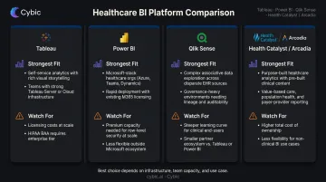
Microsoft Power BI
Best for organizations already running on the Microsoft ecosystem - Azure, Teams, Microsoft 365. Integration and governance are straightforward, often at lower licensing cost, making it a practical fit for smaller health systems without dedicated BI staff.
The trade-off: visualization depth and interactivity lag behind Tableau for complex clinical analytics, and data blending from heterogeneous healthcare sources has historically been more limited.
Qlik Sense
Qlik's associative data model lets analysts pivot across multiple data dimensions without predefined query paths - useful for exploratory, non-linear clinical analysis where questions evolve as you dig.
The downsides are real, though: steeper learning curve for non-technical healthcare users, and a smaller ecosystem of healthcare-specific connectors and community resources compared to Tableau.
Purpose-Built Healthcare BI Platforms (Health Catalyst, Arcadia)
Large health systems with complex clinical quality reporting, population health management, or value-based care requirements are the natural fit here. These platforms are built around healthcare-specific data models and regulatory reporting workflows - areas where general-purpose BI tools require significant custom work.
The real costs are flexibility and lock-in. Custom analytics beyond the pre-built content are limited, and switching costs are high. For some organizations, that's an acceptable trade for clinical depth; for others, it isn't.
Quick comparison at a glance:
| Tool | Strongest Fit | Watch For |
|---|---|---|
| Power BI | Microsoft-stack health systems, smaller BI teams | Limited visualization depth for complex clinical use cases |
| Qlik Sense | Exploratory, non-linear clinical analysis | Steeper learning curve; smaller healthcare connector ecosystem |
| Health Catalyst / Arcadia | Large systems with value-based care and quality reporting needs | Reduced custom analytics flexibility; vendor lock-in risk |
Frequently Asked Questions
What is Tableau used for in healthcare?
Tableau is used to visualize and analyze clinical, operational, and financial data, including patient outcomes, staffing levels, readmission rates, public health trends, and billing anomalies. It surfaces that data through interactive dashboards that support faster, data-driven decisions across provider, payer, and life sciences settings.
Is Tableau HIPAA compliant?
Tableau can be deployed in a HIPAA-compliant manner when organizations sign a BAA with Salesforce/Tableau and properly configure role-based access controls, PHI masking, and audit logging. HIPAA compliance is a shared responsibility - it is not a default out-of-the-box setting.
What types of healthcare data can Tableau visualize?
Tableau can connect to EHR/EMR records, claims and billing data, lab results, staffing and scheduling data, patient satisfaction scores, supply chain data, and public health datasets. Most connections run through data warehouse intermediaries rather than directly to source systems.
How does Tableau connect to EHR systems like Epic or Cerner?
Tableau doesn't typically connect directly to EHR systems. It pulls from reporting databases, data warehouses, or governed API layers that EHR vendors expose. An ETL pipeline is usually required to extract, standardize, and load EHR data before Tableau can consume it.
Can Tableau be used for predictive analytics in healthcare?
Yes, through integration with R and Python (including TabPy), Tableau's built-in forecasting, and connections to ML model outputs. Common use cases include readmission prediction, outbreak forecasting, and staffing demand modeling - each requiring an underlying data science workflow.
What are the most common healthcare dashboard types built in Tableau?
The most frequently deployed dashboard types include:
- Hospital operations: bed capacity, wait times, and throughput
- Patient outcomes and quality metrics
- Workforce and labor productivity
- Population health and disease surveillance
- Financial and billing anomaly detection